In the third part of my blog looking at Rangers kit miscellany, we turn our attention to the four year period between 2002 and 2006 when the club manufactured their own playing kit.
2002-03
Manager – Alex McLeish. Kit Manufacturer – Rangers. Shirt Sponsor – Diadora/NTL
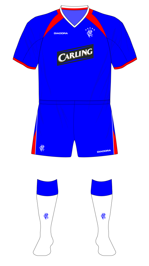
Home – Blue shirts, white shorts, black socks with red tops.
Away – Orange shirts with blue trim, blue shorts, blue socks with orange tops.
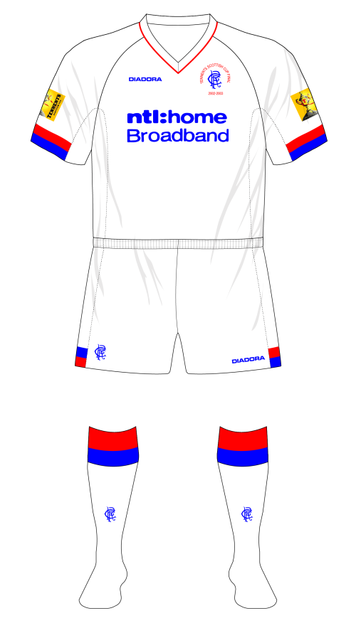
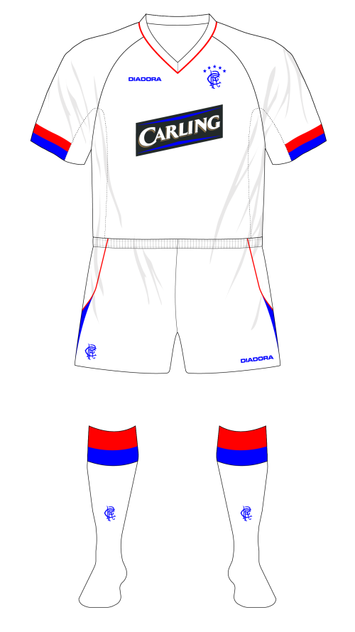
Third – White shirts, white shorts, white socks with blue and red tops.
If you’re nerdy about kits (and if you’ve found your way to reading this, then there’s a good chance you are,) then you might have looked at Rangers’ three new strips in the summer of 2002 and thought ‘hmm, they don’t really look like Diadora kits.’ If you did, then you’d have been right.
Lots of businesses make decisions each week on whether they should continue delivering key parts of their business themselves, or whether they should pay someone to do it for them. An example is transport; a manufacturer may analyse the costs of shipping their wares to their customers, and decide that the cost of maintaining their own fleet of vehicles and paying drivers’ wages is less effective than simply paying a haulage contractor to do it all for you. That’s outsourcing. Sometimes the converse might be true, where bringing the operation back in-house represents an increase in costs in some areas, but you’re able to offset them against other parts of the business, and you have full control again.
Sometimes the benefits and disadvantages are little more intangible. It’s like when you want your house painted and decorated; you can pay a professional £500 and they can do it in 3 days, or you can do it yourself, only paying for the paint, and you don’t have strangers in your house, but it takes you three months to finish the job.
Football clubs face the same decision-making process with parts of their operation; whether to outsource or not. Commonly, big clubs seem to outsource catering, because there are a lot of catering specialists out there – it’s relatively straightforward to start up a business that deals with the vending of hot and cold snacks once a fortnight. It’s low risk and low value for the club, but at least it gets it off their portfolio and potentially reduces overheads.
On the flip side, the production of kit has almost always been outsourced because designing, developing, and manufacturing performance athletic wear is a bit more specialised than selling a pie. That’s being slightly facetious, but I think it’s broadly true. The football shirt that you see on display in a high street shop is the result of contributions from graphic designers, textile designers, pattern makers. It’s been subject to all sorts of testing, how it looks under floodlights, how effectively it wicks sweat, how well does it repel rain, does it give the wearer runner’s nipple? Is it fashionable, does it dovetail neatly enough with the club’s history?
This does generally require suitably experienced and trained professionals. The biggest suppliers have arguably the best designers, and will factor this cost into the bids they make to clubs, who don’t really have much of a choice but to outsource given that they don’t have access to the required specialist expertise and manufacturing bases.
That hasn’t stopped some teams from designing their own kit though. There are numerous examples of clubs doing so, one of the more notable examples being Leicester City’s Fox Leisurewear, whose kits the Filbert Street outlet wore for eight years in the nineties.
As mentioned in the previous instalment, a graphic design student, on placement with the club, had apparently had some input into the 2001-2002 kit (although to what extent this was debated,) with the student observing that David Murray was ‘pleased with her work.’ Perhaps this set pins tumbling in the mind of the steel magnate. Rangers already owned a chain of retail outlets, the Rangers Megastores, with branches at Ibrox, in Glasgow, Paisley and Belfast. They had their own telesales arm, and they evidently felt they could source a competent designer inexpensively enough. All they needed then was someone to manufacture the kit, and the club could cut the middleman (Nike, or Adidas,) out of the picture. The costs might be higher, but the profit margins would be gigantic, and they’d all go into the club’s coffers.
According to a Sunday Mail article in April 2001, the club were already considering producing their own kit. By November of the same year, a break clause in the deal with Nike had been exercised, with David Murray noting in an interview with the Herald that “by producing our own strip we’ll maybe sell a third fewer than the 600,000 Nike sold nationwide for us under our previous deal, but the profits will go to us instead of to retailers.” It’s not entirely clear if Murray was intimating that fewer shirts would be sold because kit manufacturers had better distribution avenues, or because the products would be less fashionable, or potentially of a lower quality design and manufacture.
However, as ever with Rangers kits, things weren’t that clear cut. The day after the Daily Record ran a story about the new strips in January 2002, the Sun published a fax purportedly from Rangers ‘clarifying’ some of the points. Notably, it stated that the club wouldn’t actually manufacture the kit themselves but a ‘third party specialist’ would do so on their behalf, which appears to rebut the Record’s claim that David Murray’s Carnegie Sports International had been awarded a contract. However, a month later the Mirror insisted the English-based Dewhirst Group would make the strips, a claim which certainly seems to check out; as of December 2017, Dewhirst’s website listed ‘Glasgow Rangers’ as one of their clients. Rangers’ annual report, issued with their accounts in September 2003, observes that ‘manufacturing continues in a Nike approved factory, which also produces replica shirts for Manchester United and Barcelona.’
Regardless of who designed and actually made them, the new strips were launched shortly afterwards, in April 2002. They would certainly make an impact.
Home
The kits were, as had perhaps been lampshaded by David Murray, less sophisticated garments than those served up by Adidas and Nike. They carried on the Advocaat tradition of V-neck collars (the Dutchman was still nominally Director of Football at the club by this stage); it would be another 3 years before the outfield players would don some other type of neckline.)
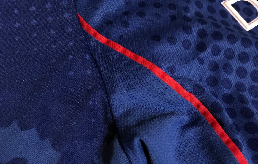
The royal blue home shirt featured a Johnny collar. Johnny collars, essentially a combination of a V-neck and a wing collar, were first introduced into football’s design vernacular in the late 1970s, and while prone to drifting in and out of fashion remain popular to this day – Northern Ireland’s 2018 kit features one. The wrap over V-neck part was contrasting white, while the wing element was body blue with a red line offset from the edge. Wedge-shaped, body-coloured breathable panels appeared under the arms, lined with red piping at the front edge; arcing armscyes made an appearance on all three outfield shirts. Shirts of this pattern are said to have raglan sleeves, after the 1st Baron Raglan. Apparently he, or someone on his behalf, had devised the raglan sleeve following the loss of his arm at Waterloo (the battle, not the station,) as the larger armholes made it easier for him to put jackets and coats on.
The unique selling point of the home shirt was that it featured a repeating graphic comprised of the lion from the club crest, in various sizes and positions, and a modulating halftone effect woven into the fabric itself. Supporters were told that each jersey would feature a singular and unique manifestation of the graphic pattern, and so no two shirts would be alike. I suspect that it was cheaper and more efficient to simply cut the shirt’s pattern at random, rather than ensure the designs aligned perfectly for each jersey, as the similarly complex Adidas design of 1994-96 had.
And that was essentially all there was to the shirt. The RFC monogram appeared on the left breast, and tellingly, the RFC crest could be found on the inside of the neck where the manufacturer’s logo traditionally appears. Football authorities normally allow kit manufacturers to place their marque on the strips they make, within certain parameters, and their emblem is usually found on the right breast of the shirt. As Rangers were ostensibly the manufacturer, they hit upon the cunning wheeze that they could ‘rent out’ the space. In their March 2002 piece linking Dewhirst to the manufacturing of the kit, the Mirror also claimed the Italian sportswear manufacturer Diadora had agreed to pay Rangers £1 million per year just to have their logos on the kits and attendant leisurewear.
The shorts were also of traditional construction, white with blue horizontal piping an inch above the hem, and still a slightly shorter cut than contemporary fashion dictated. The socks continued the theme, being a thoroughly respectful interpretation of the traditional black with red tops, incorporating the monogram in white on the shin.


Rangers 2002-03 home shirt detail
Away
While the home kit was nothing to write home about, the away kit would inspire dozens of angry words, letters, and articles. The club had apparently engaged with 3000 fans via focus groups to consult on the concepts for the new kits. The home and the all-white third strip were traditional enough, and uncontroversial. The away…well, it was orange.
There are a number of clubs throughout the world football who are associated with a particular group of society, be it economic or political – these associations can date from the time of the clubs’ formation, and might not necessarily be representative any more, but their spectre lingers on. Boca Juniors and River Plate, Sevilla and Real Betis, St. Pauli…these clubs have traditionally drawn their support from certain socio-political groups.
Rangers and Celtic are potentially unique in world football in that their supports have been traditionally delineated by politics, and religion, and by extension, social standing. I don’t want to digress too much into analysing this element of the west of Scotland’s culture, because that’s a five-part blog in itself, but I do think a bit of a recap by way of background is helpful.
People with a passing knowledge of the Old Firm rivalry, even within Scotland, probably delineate the two clubs followings along the following lines – Rangers fans are right wing, Conservative leaning, Loyalist, Unionists, Protestants, voted ‘No’ in the Independence referendum, while Celtic fans are left wing, Labour voting, Nationalists, Catholics, voted ‘Yes’. And that’s true, to an extent, although like the examples mentioned above, it was probably truer in the early 20th century than it is today. It’s probably fair to say that your modern-day Rangers or Celtic fan probably doesn’t quite fit in with the stereotype formed for them, even by other Glaswegians.
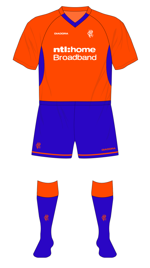
At the same time, many Rangers fans do strongly identify with Protestantism, Unionism, and Loyalism, and Protestantism, Unionism, and Loyalism have connections to both the Dutch King William of Orange, and the Orange Order, and the Orange Order is a controversial organisation in Scotland. Virtually any other club in Scotland (well, maybe not Celtic…) could adopt an orange away kit and no-one would bat an eyelid, but the connection between Rangers supporters and the Orange Order led to the shirt being decried as sectarian on the day of its unveiling. For their part, the club described the colour of the kit as being ‘tangerine’, rather than orange, which didn’t make a lot of sense given that the retail director stated the colour was in tribute to the Dutch contingent at the club.
Despite its controversial colourway, the kit itself was fairly perfunctory. Following roughly the same construction pattern as the home and third shirt, it had an orange v neck collar that switched to blue where it intersected with the arcing armscyes.
The breathable panels at the sides of the jersey were also contrasting blue, while the Diadora logotype, the RFC monogram, and shirt sponsor were all picked out in white. There was a slight deviation from NTL’s branding on the home shirt here. While it probably seems a bit absurd today for a home entertainment provider to specify that you can acquire both digital TV and broadband from them, back in the early 2000s, this was quite a new thing. Thus, the home shirt’s branding was altered from the previous iteration’s ‘ntl:’ to read ‘ntl: home digital TV’, while the away and third shirts read ‘ntl: home Broadband’.
The shorts were variants of the home shirts, replacing white with blue and the blue piping with orange, and the socks were simple blue affairs with orange turnovers.
In October 2002, the Sunday Herald ran a story claiming the orange strip would be retired at the end of the season, and quoted a club spokesperson that this was a ‘commercial decision, not based on politics.’ Continuing, she said ‘we change the shirt every season with new designs to try to make it new and fresh.’ The kit did make two more appearances before heading to the great laundry hamper in the sky though, away to Kilmarnock in December, and unusually, a cameo in the Scottish Cup final.
Rangers’ controversial 2002-03 away kit
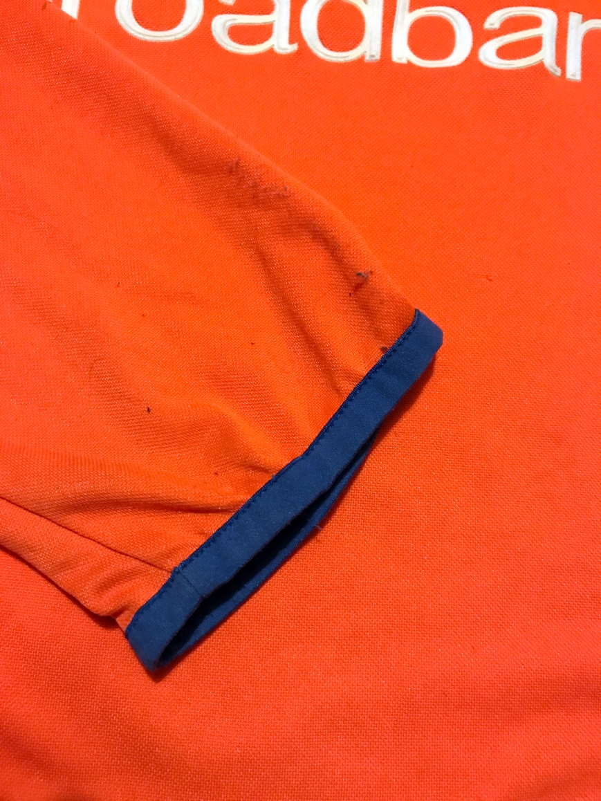
It was a very orange shirt (dust model’s own.) Note the blue tape trimming the cuffs of the long-sleeves, not present on the short-sleeved version.
Third
Rangers weren’t shy about admitting the point of producing their own kit was to generate revenue; David Murray had also observed that to generate revenue they had to shift more units, so in that context it makes sense that a third kit was introduced (well, it was unlikely to be for any potential clashes against teams wearing orange and blue.) Like its fellows it was a simple affair, predominantly white, down to the V-neck. While most V-necks are trimmed with colour at the free edge, this one had a thin strip of red material at the seam with the shirt. Otherwise, only the blocks of red and blue at the bottom of the sleeves gave it any sort of individuality. Like the home shirt, body-coloured breathable panels were featured at the sides.
The block motif was repeated at the sides of the shorts, at the hem, and the white socks were topped with turnovers formed of blue and red hoops, with all logos rendered in blue.
Rangers 2002-03 third kit, Scottish Cup Final variant
Goalkeeper
Stefan Klos was once more the club’s first choice goalkeeper, playing in all 50 matches. In the last couple of years of the Nike deal, Klos had taken to wearing mainly black or sky blue, and these colour options were retained when the club started making its own kit, with a red jersey also thrown into the mix. Der Goalie and his custodian colleagues would mainly wear shirts in red, black, or sky blue in each annual template over the next four seasons.
The three shirts followed a similar pattern to, and were not dissimilar in form from, their outfield cousins: a standard collar type, arcing armscyes, and breathable panels at the sides of the body. But there were enough variants on the basic template to distinguish them aside from the colourways.
The black variant, ostensibly the first choice as it was worn the most often, was the simplest. It was a bloc of pure black, with only the crest and logos being a different colour – pure white in this case.
The red shirt surrendered a little more of its detail and its further design commonalities with the outfield shirts. Its collar was not a uniform black polo; a clerical collar effect was created by the portion between the two armscye seams being body-coloured. Additionally, a small band of black material continued unabated next to the neckline seam, not unlike the third kit. The body itself (and the arms) featured the same halftone/lion graphic of the home shirt, as well as the contrasting side wedge panels of breathable material also found on the away kit. Like the black shirt, the crest and logos were white.
The lesser-spotted sky blue version, meanwhile, featured a little more detail still. Red featured on the border between the black side panels, and on the collar arc, with the rest of the collar being black. All three jersey were available with both Digital TV and Broadband branding to match the outfield shirt being worn. Klos preferred to wear the black jersey, even in the two home games against the navy-wearing Dundee when his outfield colleagues changed to their alternative sets.


Miscellanea
In terms of kit mash-ups (copyright Denis Hurley), 2002-03 was a fairly quiet season with only a handful of variant kit combinations (10%, compared with an average of 28% per season between 1997 and 2006 *pushes nerd glasses up bridge of nose*.) In fact, from August to October of 2002 the club went on a run of 13 games without wearing a single alternative item of kit, the longest streak for five years, which they promptly bested in the second half of the season, failing to tinker their tailoring for 16 games.
That said, there was still opportunity for some oddness. Of the three occasions the orange strip was worn, one was at Ibrox, against Dundee. This would prove to be a semi-regular occurrence against Dundee in the early noughties, as the Taysiders adopted an Argentina-inspired sky and white away strip to go with their navy home kit. The third strip saw more action, worn four times, all against…Dundee, although in the January 2003 match, it was inexplicably paired with the home shorts. Equally, the May 2003 meeting at Dens Park saw Rangers wear the third strip with the bespoke white socks with blue tops that they’d worn a few times with the home kit that season. For some reason. I’m really not sure why.
Those white socks, in the same style as the home socks, and along with a complimentary blue-with-white-turnover set introduced the following year, would see action almost every season between 2002 and 2013, and the white set would appear as recently as July 2016. Usually (but not always) they were worn in European competition, but oddly they would sometimes be worn even in seasons where white socks formed part of an away or third kit.
As far as squad numbering and lettering goes, the SPL had introduced a mandatory uniform font for in 1999, and this typeface would remain in place until 2010; by and large this was what you would see on the back of Rangers’ own brand shirts.
There were the odd exceptions however, where the club might appear in jerseys with a different lettering font, in a style very similar to that worn on occasion during the Nike years, and/or unbranded SPL numbers. In terms of shirt identifiers , the club would follow a fairly set, if typically strange pattern, as follows:
League: SPL letter and number font, squad numbering in all matches.
Domestic cups: SPL numbers, own brand font and squad numbering in early matches (occasionally 1-11), SPL letter and number font and squad numbering up to final, SPL letter and number font and 1-11 numbering in finals.
European competition: Own brand font and unbranded SPL numbers.
The club won the treble that season, and for their two Hampden finals there was some unusual apparel. In the League Cup final, against Celtic, they decided to switch to red shirt numbers outlined in white. They also ditched the squad numbers for 1-11 with names instead; clearly this was at the club’s discretion, as Celtic retained their squad numbers.
1-11 numbering was also in place for the Scottish Cup final against Dundee in May, with the exception that it was the third kit worn. Curiously, goalkeeper Stefan Klos wore the third shirt in that final, along with his regular black shorts and white socks. He wouldn’t be the first or last Rangers goalkeeper to wear an outfield shirt in goal, but I’m not entirely sure why the need to change was felt. It would be the controversial kit’s last competitive appearance.
As there was a period of strange tranquillity this season regarding kit variations, so too were the squad numbering changes few and far between. A few big players left (Kanchelskis, Vidmar, Flo, Dodds, Latapy) without any notable replacements coming in, save the young Spaniard Mikel Arteta, who took the 23 shirt vacant since Kenny Miller departed the previous December. Meanwhile, the young pair of Bob Malcolm and Allan McGregor took numbers more befitting of first team players, moving from 31 to 12 and 33 to 22 respectively.
Competition patch-wise, the SPL changed their patch from rectangular to oval. As Rangers had finished second in the league the season before, they wore the standard navy versions rather than the Champions’ gold. The SPL patch appeared in all 38 league games, the early rounds of the League Cup, and the middle rounds of the Scottish Cup.
In the League Cup semi-final and final, CIS Cup patches were worn, and a similar case prevailed in the Scottish Cup final. Rangers’ European adventures didn’t last very long this season, consisting of a brace of matches against the Czech side Viktoria Žižkov, The jerseys were bereft of patches in both these games, as they were in the third and fourth rounds of the Scottish Cup.
Several of the big name players from the Advocaat era departed in the summer of 2003, which meant some changes to the squad numbering. Shota Arveladze slipped down from 24 to 7, vacated by Claudio Cannigia.
| Kit Type | Matches Used |
| Home | 39 |
| Home alternatives | 4 |
| Away | 3 |
| Away alternatives | 0 |
| Third | 2 |
| Third alternatives | 2 |
Table 1 Rangers kit combinations, 02-03
2003-04
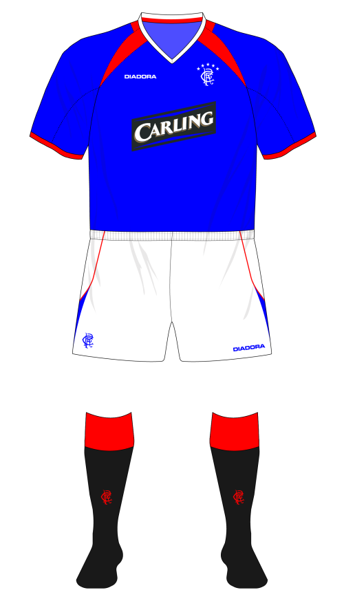
Manager – Alex McLeish. Kit Manufacturer – Rangers. Shirt Sponsor – Diadora/Carling
Home – Blue shirts, white shorts, black socks with red tops.
Away – Red and white striped shirts, blue shorts, Red socks with white tops.
Third – White shirts, white shorts, white socks with blue and red tops.
Background
On the morning of 24th May 2003, Rangers fans might have opened their Saturday newspaper and found a picture of Barry Ferguson, Bob Malcolm, and Ronald de Boer smiling back at them, kitted out in the in club’s new home strip.
It probably wasn’t great timing. Any other week, rather than on the eve of the club’s biggest match for four years might have found supporters in a more receptive mood. The following afternoon, Rangers would play Dunfermline Athletic at home on the last day of the season. In the 9-in-a-Row era, this type of game would have been little more than a kickabout in the sun, a chance to play some promising young players and to parade the Championship trophy. Over the intervening 5 years though Celtic had got their act together and were now proving to be more than a match for Rangers. After going nearly a decade without a title, they’d won the league in 1997-98, 2000-01, and 2001-02, and on that particularly gorgeous day the old rivals would go into the last round of SPL fixtures neck-and-neck, on the same number of points and with the same goal difference. The league title would be decided by which team got the better result on the day, but in order for Rangers to secure the Championship, they not only had to match Celtic’s result, they had to at least match their score.
Celtic beat Kilmarnock 4-0 at Rugby Park, but a 90th minute penalty from Mikel Arteta saw Rangers better Celtic’s goal difference and secure their 50th domestic league title, the first club in the world to do so. And then someone in marketing put their thinking cap on to work out how the club could commemorate it…
Home
Between the kit being launched and being worn competitively, the club had decided to commemorate their 50th title by adding 5 stars above the crest, one for each ten titles, akin to Serie A’s convention. The first iteration of the motif was a little gauche, with all the stars being the same size and plonked in a line atop the monogram and it would take a little time to settle down to a finalised version.
The home shirt adorned by this updated crest was a bit of a departure from its predecessor, having done away with the unfashionable collar and the complicated graphic print for a start. Collarless shirts had become de rigueur in the football world over the previous 5 years or so; the away kit of 2001-02 had featured one, but this was the first home shirt with a collarless neckline. It formed an interesting partnership with a set of raglan sleeves. Tucked into the right angle between the armscye and the white tape-lined v neckline on each side were two red triangular darts, joined by a red band of fabric that looped round the back of the shirt. Similar to the 01-02 away, this gave the impression from the back that the shirt had a red collar with white trim. The underside of each sleeve was of body-coloured breathable material, and red tape described their ends. The overall effect, with the collar ‘fangs’ was a shirt that had a passing resemblance to Manchester United’s home shirt, released the previous summer.
Shirt sponsor NTL’s parent company had filed for bankruptcy protection in the US the previous summer. Their joint sponsorship deal with the Old Firm clubs was due to expire in the summer of 2003 anyway, so perhaps it wasn’t a surprise that the telecommunications firm weren’t keen on renewing the arrangement. Rangers and Celtic instead struck a deal with the Canadian brewing company Carling, and would display their upwardly-slanting inverted parallelogram logo on their shirts for the next seven seasons. There was a bit of a twist here though; the Carling logo of the time featured red chevron-like flashes between the wordmark and its top and bottom, a colour that doesn’t really appear in either Rangers or Celtic’s colour schemes, so the chevrons appeared in blue and green on the club’s respective shirts instead. Well, for the first two seasons of the partnership with Rangers at least – Celtic retained the green flashes for the full seven years. Diadora returned as kit sponsor, their logo unchanged.
The shorts were very simple. In standard white, they had a lazy blue ‘s’ at each side, tapering from hem to waistband, red piping tracking the rear edge. They came complete with the monogram and Diadora logotype in blue.
The socks were interesting. I’ve written in the previous two parts about how designers struggle to resolve Rangers’ traditional look with contemporaneous trends, resulting in the Gers almost always ending up with identical black socks with red tops, and only minor cosmetic differences between each pair. This time something different was attempted. The strip worn on the launch day in May 2003 featured black stockings with red tops true enough, but in a dramatic break with tradition they also had red feet and ankles, and the monogram on the shin was blue. However, as far as I can tell, these socks were never worn in a professional game…well, not with the 2003-05 shirt anyway. Instead the club appeared to spend the next two years wearing the 2002-03 socks instead.
Rangers’ 2003-05 home kit
Rangers’ 2003-05 home kit, European variant
Rangers’ 2003-05 home kit, ‘Everton’ variant
Rangers’ 2003-05 home kit, ‘Chelsea’ variant
Away
The away kit was identical in pattern to the home, but in a different and unusual colourway for the club. The red faux collar and ‘fangs’ of the home were swapped out for white and blue respectively, and the blue body was replaced with red and white vertical stripes. Blue tape demarcated both the neckline and the ends of the shirt sleeves.
Normally the stripes on the sleeve of a shirt appear perpendicular to those of the body when the garment is laid out in a ‘T’ shape, so the sleeve stripes appear parallel to those on the body when the garment is worn. The sleeve stripes on this shirt however were laid out diagonally, making for a slightly strange effect, although they broadly appeared horizontal. If you squinted. The materials used in the away shirt were notably different to the home shirt though; while the latter was a traditional polyester fabric, the former was formed of red and white stripes of knitted polyester woven together. The bottom half of the each sleeve was made of breathable material, as per the home kit, but unlike the first choice, the ‘fangs’ were also of the same breathable fabric. The crest and Diadora logo appeared in blue, with the Carling logo in the same arrangement as on the home shirt.
The blue shorts were similar to the home set, if slightly different. A white contrast stripe ran almost straight, waistband to hem at each side, before deviating forwards halfway down. A red triangular wedge sat snugly in the resultant space, and the set was completed by a pair of red socks with white tops which gave the impression of a large degree of interchangeability with the home set. Typically, if there was any modular nature to the kits, the club didn’t use it all that often. However…
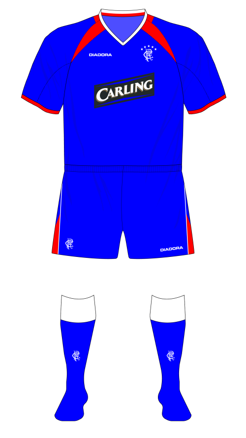
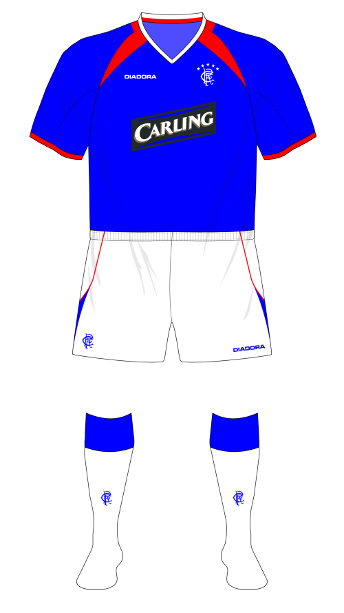
Winning the league the season before gave Rangers a decent crack at qualifying for the Champions League again. Aside from the first and last of the 8 game European campaign, an all blue kit was worn instead of the traditional outfit. Rangers have historically periodically worn all-blue in Europe (it was Denis Hurley’s Museum of Jerseys piece on the all-blue 96-97 strip worn against Ajax that inspired this blog in the first place) but it wasn’t until the early noughties that the club seemed to embark on developing a ‘European kit’, a concept that’s been used by Manchester United (Red shirts, white shorts and socks,) and Tottenham Hotspur (all white.) In fact, in 45 European matches in which the home shirt was worn, from July 2000 to March 2006, the rest of the kit was all blue on 11 occasions, with black socks and white socks worn with the blue shorts once each.


Third
The previous season’s white third kit was retained, perhaps because the club realised how daft a red and white striped away kit was when the only time you wore an away kit was because your opponents wore blue and white stripes. The sponsor was updated to a blue chevroned Carling logo, and the 5 star motif appeared over the monogram. Rather than upgrade the shorts as well, the club appeared to take the practical decision to wear the home shorts, which had the star motif, instead. Well, that’s what the logical centre of my brain had assumed for the otherwise incongruous reason to never wear the correct third shorts. When Denis sent me through the illustration of the 2003-04 third kit arrangement, I nearly replied to him pointing out his error, then I thought I had better double check…and lo and behold, neither the home nor away shorts featured the star motif. The decision to go with the 5 stars had apparently been something of a spur of the moment decision in June 2003, but evidently the club had decided not to order any sets of shorts with the new crest on them.
Rangers’ 2003-04 third kit
The white socks with the red and blue turnovers were mercifully (if only for the sake of my sanity) retained however, and even saw duty with the away kit in the second of its two outings. Used only twice competitively, the Atletico Madrid-style outfit didn’t even last a full season. Its successor was introduced in the last home game of the season against Hearts, Rangers taking to the Ibrox turf (for the third time domestically in two seasons) wearing a change outfit.
As the ‘in-house’ kit design arrangement continued, the offerings seemed to get more and more simplistic and reductive. This new away kit was white, had a collarless v-neckline with blue tape, and a red and blue sash sloping from right shoulder to left hip. That’s pretty much it in a nutshell. No graphics, no fancy trim, no oxter vents. Apart from the usual collection of logos, there was nothing to distinguish it from any other blue-trimmed shirt. The monogram was also slightly modified with the placement of the 5 stars tweaked to better integrate them with the crest in the ten months since their hasty introduction. For a start, they were now a contrast colour, appearing in red opposed to the letters’ blue, and instead of appearing plonked in a line atop the monogram, they were now arranged in an arc around their counterparts. It’s not entirely clear from the execution on the shirt, but the stars decreased in size from the central pole star outwards.
For the first time since the Nike days, an authenticity tab appeared on the bottom right of the shirt, comprising of a crest commemorating the 50 league wins, and next to it, housed in a separate blue field, a small hologram.
The shorts and socks were perhaps more notable, if only for circumstance rather than design. While Dick Advocaat had certain mandates that had to be observed in terms of kit design, since he left to manage the Netherlands, his influence over the playing kit was understandably beginning to wane a little. True, the shirt still had a V-neck, but the shorts, unfashionably skimpy for the best part of five seasons, were beginning to grow in length long after it had become fashionable, much like George Martin’s hair in the seventies.
The new away shorts were long and blue, with two 3cm contiguous red and white stripes at each side. They don’t sound out of the ordinary, and they looked fine in the press call, but in an actual match situation they looked a bit like a pair of boxing trunks, the cut too voluminous and the side stripes appearing to dominate the garment. It’s probably not surprising that the shorts were never seen again, with the home shorts being paired with the away shirt whenever it was required.
The socks were plain white, aside from a red and blue stripe, recalling the motif on the shirts and shorts, on the shin just under the turnover (and not dissimilar to a Diadora design conceit of the time.) Unusually, these socks were (okay, not unusually, this is Rangers,) not worn very frequently, only appearing in 3 of the 7 matches their parent shirt was worn in.
Goalkeeper
Traditionally, Rangers’ goalkeeper had worn a yellow jersey, and had maybe a red spare in case of a clash. This was broadly the case up until the early-90s when goalie shirts across the world exploded into a cacophony of colour and geographic shapes, looking like the proverbial explosion in a paint factor (or if someone had paused a VCR playing any scene containing Unicron’s innards from Transformers: The Movie.) In the last 90s however, the shirts worn by custodians started to get more reserved again. In Rangers’ Nike era, the colours black or navy, sky blue, and red became the favoured colours for keeper kits, a convention that would remain in place until the Umbro years proper from 2006 onwards.
In keeping with the first year’s in-house efforts, Stefan Klos’ new set of shirts were similar to the outfield shirts – did this represent design consistency, or lack of ideas? Each featured an interesting variation on the age-old goalkeeper’s polo neck though; ostensibly a knitted collar with a contrast stripe around the free edge, and two contrasting ‘fangs’ at each side breaking the collar’s complete circle.
The navy and sky variants complimented each other by each utilising a third shade of blue roughly that sat between the two main tones. This mid blue was present on the collar trim and fangs of the navy shirt, while it only appeared as collar and cuff trim on the sky jersey, navy being used for the collar and fangs. A set of navy shorts trimmed with mid blue tape at the leg hem were available, and matched both shirts, as did a pair of navy socks. A red shirt with black fangs, and black shorts were also available. The navy version would be the one to appear most often that season.
Miscellanea
While 2002-03 had been unusually placid in terms of weirdness, this season saw things start to get a bit freaky again. Rangers wore four outfield shirts during the season, only the second occasion they’ve done so in recent times. Seven combinations of shorts and socks were paired with the four shirts, with the most common alternative being the European all-blue strip. White socks also made an appearance with the home shirt and shorts on three occasions.
Rangers made the semi-final of the League Cup, but there was no repeat of the 1-11 numbering that had occurred in similar situations in recent seasons. The elegant SPL font continued to be used domestically and in European competition; white with black borders for the home shirt, black with white borders for the away and third, and blue with a white inset border for the new away.
The oval SPL sleeve patches were updated to the gold-detailed ‘Champions’ versions. The Champions League Starball patch was worn in the group stages of that competition, and the CIS Cup patch appeared in the semi-final loss to Hibernian. However, the club also turned out in four matches without any competition markers on the shirts at all – the two Champions League qualifiers against Copenhagen, and two early League Cup ties against Forfar and St. Johnstone. The latter two occasions don’t appear to have been anything to do with the Scottish Football League, who ran the League Cup – it was just one of Rangers many kit peccadilloes.
On the squad numbering font, Shota Arveladze switched from 24 to 7, and Chris Burke continued his route from Academy to first team as he swapped 30 for 17. Similarly, Alan Hutton bounced down from 32 to 20 as the club continued its philosophy of youth team players approaching zero season on season.
| Kit Type | Matches Used |
| Home | 38 |
| Home alternatives | 9 |
| Away | 1 |
| Away alternatives | 1 |
| Away 2 | 1 |
| Away 2 alterantives | 0 |
| 3rd | 2 |
| 3rd alternatives | 0 |
Table 2 Rangers kit combinations, 03-04
2004-05
Manager – Alex McLeish. Kit Manufacturer – Rangers. Shirt Sponsor – Diadora/Carling
Home – Blue shirts, white shorts, black socks with red tops.
Away – White shirts with a red and blue sash, blue shorts, white socks.
Third – Red shirts with navy trim, navy shorts, navy socks.
Background
As, for the first time in four seasons the club retained the home kit for a second season, and the away kit had already been introduced at the tail end of the previous season, there was only one new outfield outfit to be launched.
Third
Adopting a white away kit meant that the existing white third shirt was redundant, and with the 2003-04 red and white away kit not really fit for purpose as an emergency option (although to be honest, when has ‘fitness for purpose’ ever affected a club’s sartorial thinking?) a new red third kit was introduced.
If you’re nerdy about kits (and if you’re still reading this, then there’s a good chance you are,) then you might have looked at this new third strip in the summer of 2004 and thought ‘hmm, that looks like a Diadora kit.’ If you did, then you’d have been…well, you’d have been confused. Confused and angry. Maybe hungry.
Despite no-one other than my paternal grandfather being interested in football, my family have always done their best to enable my fascination with playing kit. It was my mother and grandmother who bought me my first kits (Rangers 85-87 away, Scotland 85-89 home, Rangers 87-90 home,) and it became a family tradition that I could expect to receive some form of Rangers kit as a Christmas gift from my mum.
So was the case at Christmas 2004 when I opened a package to find a pair of the 04-05 Rangers third socks. I’m always stockpiling football socks for my misadventures in 5-a-side, so gifts like these were always welcome, but what I particularly observed and filed away in my brain was the clear Diadora branding on the socks.
Clothing is a strange intersection of the creative parts of the human mind, encompassing industrial design, and art, but both disciplines strive to develop a voice, a brand, an identity. This is no less true for a company designing kit for Morecambe Town than it was for Charles Rennie Mackintosh. You only have to look at the Adidas’ legal battles with Admiral and the Irish firm O’Neill’s to see how fiercely a company will protect their brand identity once it’s established.
That’s mainly because creating some form of branding that is instantly recognisable, associated with your product, and easy to reproduce, isn’t that straightforward. It’s probably more complicated now with the sheer volume of companies, brands, and firms that have been established in the last century since graphic and industrial design came into their own.
Adidas have been using the three stripe device since 1952 and it’s probably the outstanding example of a brand and its branding becoming synonymous – the company even refer to themselves as ‘Die marke mit den drei streifen’ – the brand with the three stripes, in German. They didn’t devise the three stripes themselves, instead buying the intellectual property of the Finnish company, Karhu, but they clearly knew a good thing when they saw it.
Diadora’s attempt was to take a ‘D’ shape, and elongate it so it resembled a round-nosed bullet. Rotated 90 degrees, this ‘bullet’ appeared on Diadora’s shirts (on the outside of the sleeves, above the cuff,) on the shorts (above the hem,) and on the inside and outside edge of each sock. It might have been a relatively simple device, but it was instantly recognisable
With each element of the kit marked with Diadora’s brand identity, it was difficult not to parse the new third kit as an actual Diadora offering. The fact that it was almost identical to a template worn by both Leeds United and Sunderland further reinforced the suspicion that this wasn’t an in-house production.
It might be reasonable to surmise then that, similar to 96-97 and 97-98, Rangers had hurriedly commissioned a third kit to avoid colour clashes that hadn’t been anticipated, and didn’t have the in-house resources to design something from scratch. But this is where the plot thickens.
By this time, most kit manufacturers were printing the sizing information, country of manufacture, and their logo straight onto the inside back of the jersey, just below the neckline (it reduced the irritation caused by the old style flappy labels.) Diadora’s style at this time was to arrange their corporate information in three boxes, arranged in a 2×2 grid, the corners of the boxes rounded where they corresponded with the outside corners of the grid.
Inside the collar of the Rangers shirt however was the club logo, implying it was a Rangers product. In addition, the shirt had been introduced at a photocall in July, ahead of what tabloid newspapers might call a glamour pre-season friendly against Tottenham Hotspur, which doesn’t entirely support the proposition it was a rush-release job.
I think it’s fair to surmise that Rangers licensed the use of a kit template from their sponsor, which the club then produced themselves, which explains the Diadora design and the Rangers logo. But the question remains why they felt the need to go to Diadora in the first place. Given the timescales, and what would come next season, the conclusion I’ve come to is that the club’s design and manufacturing arm were struggling with the demand of producing 6 new kits each season, and felt they had no option but to outsource the design and technical specification.
If they were struggling that much, could the club instead have developed a red version of the new away strip, with the red and white elements switched? It could have been teamed up with the existing away shorts and socks. Perhaps though the marketing department realised they needed something distinctive in order to sell units, and borrowing a design from Diadora was the only way to meet deadlines.
Regardless of the provenance of the strip, it was a fairly elegant effort, if only by the standards of the in-house designs. It was, as mentioned before idiomatic of Diadora’s designs at the time, with the ‘bullet’ flashes and the unusual approach to breathable material.
The patterns of football shirts had got steadily more adventurous as the decade had progressed, and the Diadora jersey offered a form of construction far more complicated than either of its stablemates. While the bodies of most leisure shirts consist of two pieces of material joined by a seam at the top of the garment, this Diadora shirt featured a yoke, not unlike a smart or dress shirt.
The yoke also bisected the collar, a twist on a variation of the standard collarless V-neck. Above the yoke seam, it was a simple navy tape-lined neck opening; below, there was a v-shaped insert, again navy, but with a gold bar across the top. All in all, this gave the effect of a single unbroken v, with the navy element ‘switching’ sides as it crossed the yoke seam.
The other characteristic Diadora twist was the placement of breathable material. While most manufacturers tender to place such fabric under the armpits or down the side of the body, The Italian kit maker’s approach was to build them into the body itself, in channels leading diagonally from the armpit to the hem, roughly tracing the line of…ahem…the milk line of mammals.
Channels is an apposite word, as the vents were long thin holes, with breathable material in a contrasting colour stitched behind. The outer material overlapped the inner panel, creating something akin to a dart, a tailoring seam used to create shape. While these vents had a function, they were also integrated into the design of the shirt, giving the shirt a Diadora-style twist.
In terms of colourway, the shirt itself was an attractive deep red, with the collar, vents, cuff tape and hem tape in navy. Navy was the main colour in the two sleeve mounted ‘bullets’, white being the other. The latter was also used to render the Diadora logo, while the Carling patch appeared with red chevrons, rather than blue, for the first time. A ‘Rangers’ patch, similar to the one on the away shirt, appeared near the hem, on the wearer’s right.
The shorts and socks were of simple construction, both being navy with red and white bullets in Diadora’s customary arrangement, on the hem at each side of the shorts, and under the sock turnovers.
Aside from the Rangers logo inside the neck, perhaps the only real difference between this and a Diadora-manufactured kit was the absence of the manufacturer’s 1-11 heat spots gimmick, a formation of 11 thermal sensitive heat spots that appeared on their kits at the top of the sleeves. Maybe the licence didn’t stretch that far.


Goalkeeper
Along with two new outfield kits, there were three new goalie shirts that carried on the duo-coloured stripe motif introduced by the away kit. The new jerseys adopted the red, sky blue, and navy/black template of the previous few seasons, but they were much more basic affairs. Each had traditional vertical armscyes, and a simple polo neck.
The black and sky versions both had matching blue collars and cuffs, trimmed with red, while the red version had black trimmed with blue. The sky shirt had a matching set of shorts, similar to the away kits, with sky and white stripes down the sides, while the red and black jerseys shared a pair of black shorts, trimmed with red and blue stripes.
Stefan Klos had started the season as first-choice goalkeeper, as he’d been for the previous six, but a serious knee injury in January ended his season. Going into the title run-in, and apparently unwilling to trust the 23 year-old reserve goalie Allan McGregor, Alex McLeish signed Ronald Waterreus instead on a short-term contract. The Dutchman did appear in the black, and sky 04-05 goalkeeper jerseys on at least two occasions each, but more often than not he wore a red 03-04 shirt instead.
Miscellanea
While Alex McLeish’s appointment as manager had coincided with a period of relative stability in terms of strange kit combinations, by 2004-05, his third full season in charge, incidences of non-standard kit being work were beginning to creep up again – 14 examples in 51 games, comprising nine combinations across the three kits.
There weren’t as many variations on the home kit as there had been the season before, with the white shorts and socks and the all blue iterations appearing in six matches. 2004-05 also saw the return of the lesser spotted ‘Chelsea’ version (blue shirts, blue shorts, white socks,) worn against Maritimo away, in the first round of the UEFA Cup.
The away and third shirts also fell victim to excessive mixing-and-matching. For a start, the white shirt was never worn with its designated shorts, instead appearing each time with the home shorts, as the white third kit had done the season before. The correct socks were also barely seen, appearing twice, in September and December. In the away shirt’s four other outings, the 2002-03 third socks were used three times, and the white and blue set mainly used with the home, once.


As for the third kit, it was worn twice, once as it was intended, and once with the home shorts and socks. Due to the lopsided nature of the SPL’s new fixture arrangement (12 teams played each other 3 times each, home and away, then after 33 games, the top and bottom 6 split off into ‘Championship’ and ‘Relegation’ groups and play a further five matches against teams in their mini-division,) clubs are no longer guaranteed an even number of home and away games against each team. So it was in 2004-05 that Rangers only played Kilmarnock away once, but Dundee away twice, though there’s no explanation for why the Gers wore the away shirt and the third shirt in each of those visits to Tayside.
There was some semblance of normality in terms of the competition patches worn by the club this season – the SPL logo adorned the shirts in all but ten matches. Two of those were the League Cup semi-final, which following the SPL split from the Scottish Football League, was run as a separate competition. The club also played four matches in the inaugural group stage format of the UEFA Cup, with their attendant patch, and in the four qualifying games, no patches were worn at all.
There were no significant changes on the squad numbering front; while a number of big name players had departed, a symptom of the ongoing rationalisation the cub was undergoing, they were replaced more or less like for like by a slew of canny new signings such as Jean-Alain Boumsoung, Marvin Andrews, Alex Rae, Nacho Novo, and the previous season’s losing Champions League finalist Dado Prso.
There was a slight tweak in terms of the squad numbering, but it was to do with the colour rather than any ranking oddities. As they had done in the 2003 League Cup Final, the home shirts were worn with red numbers and lettering outlined in white, a stylistic choice I’ve never quite been on board with. It doesn’t appear UEFA were either, as in each appearance in the UEFA Cup that season, the club switched back to white numbering (the away and third shirts weren’t used.)
Prior to 1994, embroidery on football shirts was by-and-large restricted to the strips worn by the professional players, with the logos on replica (the very word having connotations of ‘inferior copy’) kits being heat-sealed plastic. The first Rangers strip I remember having embroidered logos were the 1994-95 sets, and at that time the difference between the shirt the fans could buy and the one their heroes wore was virtually nil as computer-assisted machines reduced the cost of embroidery significantly.
There’s a line in the original Star Wars film where Han Solo languidly boasts that his ship, the Millennium Falcon can complete the ‘Kessell Run’ in “less than 12 parsecs.” A parsec however is a unit of distance not time, and since the film’s release there have been a few attempts at retrospectively explaining this apparent error. The most popular theory apparently comes from writer/director George Lucas himself – travelling at light speed requires careful navigation of star systems; black holes, asteroid fields and the like. Thus, the fastest ship is one that can plot the shortest route, rather than simply fly the fastest.
Whether you believe this or not, a similar approach applies to commercial embroidery – a machine carries out the stitching, but a ‘route map’ still has to be created, to tell the machine where to embroider. These maps are devised by humans, scanning the logo to be rendered into specialist software, then plotting the most efficient ‘route’ for the machine to stitch the logo in its respective colours.
There were however a few isolated incidences of Rangers players (Klos, Andrews, Boumsong, Ronald de Boer) turning out in shirts with logos sans-stars across 2004-06. This raises a potentially interesting question – had the club already produced a number of shirts when the decision was made to adopt the 5 star motif? Adding an element to an existing embroidered logo is time-consuming, but not impossible, and it does seem that’s what happened here, at least with the playing kit. That might also explain why the 2003-05 home, 2003-05 away/home alternative, and 2003-04 third shorts didn’t have the star motif.
Of course, another incident of shirts appearing without the stars around the crest was the League Cup Final against Motherwell, known to some as the Davie Cooper Final in tribute to the winger who had played for both clubs. For one match only, the stars would appear at the bottom of the left sleeve, with commemorative embroidery circling the crest, and the text ‘Davie Cooper, 1956-1995’ appearing on the right.
| Kit Type | Matches Used |
| Home | 36 |
| Home alternatives | 7 |
| Away | 0 |
| Away alternatives | 6 |
| 3rd | 1 |
| 3rd alternatives | 1 |
Table 3 Rangers kit combinations, 04-05
2005-06
Manager – Alex McLeish. Kit Manufacturer – Rangers. Shirt Sponsor – Umbro/Carling
Home – Blue shirts, white shorts, black socks with red tops.
Away – White shirts with red central stripe, navy shorts, white socks.
Third – Navy shirts, navy shorts, navy socks.
Background
When Umbro and Rangers parted ways in 1990, the club were arguably one of the biggest in Europe, and the manufacturer were debatably the world’s best, creating some of the finest kits of the 80s and early 90s. By the time 2005 rolled around however, the pair were starting to look a shadow of their former selves. Not that the outfits Rangers would wear in the 2005-06 season were actually Umbro efforts; the club continued to produce their own strips, and Umbro had simply replaced Diadora as technical sponsor.
Commissioning a third kit from the Italian former partners the previous season suggested that the in-house design department was perhaps running out of ideas. Football kit aficionados like to complain about the number of near identical template kits the big manufacturers provide for each team they supply each year, but the truth is a little more complicated than that. Many of us would design our own fantasy kits when we were young; some of us still do. But an actual kit requires more development than simply jotting down some designs on a piece of paper. There’s technological development, of new sweat wicking fabrics, including how breathable panels might have an impact on how the kit it built, which impacts on the design. For a bespoke kit for a big client, a designer might then carry out in-depth research on the club’s history and kit past, to highlight any elements it can incorporate into the new design (and any it shouldn’t,) while ensuring the overall package adheres to the company’s current overall design strategy.
The kit would then be presented to the club, and possibly supporter’s representatives for approval. All of the above represents a substantial number of person hours, and you’d have to multiply that by the number of big teams each manufacturer supplies across the world. Adidas for example have to provide designs for dozens of teams across the top 6 leagues in Europe, plus the whole of MLS, as well as a score of international teams. Factor in the fact that many teams have 3 kits each now, plus goalkeeper strips, training gear, leisurewear, and you can see why templates are common in sport. It’s not a modern convention either; the only differences between the shirts the Netherlands wore while winning Euro ‘88, and Germany’s alternative worn during their successful World Cup 1990 campaign were the crests and the colourway. Otherwise they were identical.
So then were two of Rangers’ three new kits the same in terms of pattern, while the third merely similar, two sets of non-identical twins and a fraternal triplet.
Home & Away
I’ve previously written about the different types of collar football shirt designers tend to employ. For the first 120 years of the game, collared shirts of various forms were employed. The 80s saw the rise of the V-neck, the 90s the wing collar. Collarless shirts came into fashion in the early 00s, closely followed by hybrid collars, which were formed of a collar at the rear part of the neck, and a collarless portion at the front – a kind of football kit version of the mullet hairstyle, if you will.
Both the new home and away shirts featured a hybrid collar, a collarless segment at the front coupled with a short stand up element that ran around the back. This stand-up part was trimmed with white piping, which curved down to meet the red-taped neckline, subsequently flowing into the similarly white-piped arcing armscyes. Further white piping appeared in arcs that curled from the armpit down to the hem. Like the neckline, the sleeves were trimmed with red tape, an arrangement that carried through onto the white away shirt, but there the piping was picked out in navy. A broad single stripe was sublimated into the fabric down the middle of the front of the shirt; a slightly deeper blue on the home kit, contrasting red on the away producing an Ajax-style effect. Further detailing included red tape at the jersey’s hem, and a small authenticity panel at the wearer’s bottom right. This time around, the panel comprised of a Union flag and a Saltire, separated by a small silver bar that read ‘Rangers’. This device would feature on all three outfield shirts in the same location.
The shorts followed a reasonably simple pattern, all white with two red elongated triangles pointing downwards from the waistband, adjacent to the side seams.
By 2005, the stars motif above the logotype had completed its evolution into its final version; 5 stars arranged in an arc above the crest, decreasing in size from the central star outwards each way, and with the stars a different colour to the monogram. The crest was rendered in white with red stars on the home, and navy with red on the away.
In the first part of this blog, I mentioned how Adidas’ design identify had got a little confused during the 1990s as they bounced from the trefoil era through to the Equipment experiment. For a while in the late 90s they used their logotype only, a fashion followed by Reebok, Diadora, and Umbro.
Umbro changed their logo at least six times between 1992 and 2015; by 2005, they’d rotated from their iconic double diamond logo with wordmark underneath, to just wordmark, back to logo and wordmark, then to simply the double diamonds, a logo they’d display on the breast of the shirts they designed, with a tweak or two, until 2015. Of course, these Rangers kits weren’t Umbro designs, a point underlined by the manufacturer licensing only their logotype to Rangers, ‘Umbro’ appearing on the right hand side shirts’ front rather than the double diamond. More intriguingly, on the shirts worn by the first team, the Umbro wordmark was heatsealed on, a cheaper method of applying logos than embroidery, and a technique that had been phased out of use on replica kits, never mind player issue kit. By December, when the logos started peeling off the players’ kits on the pitch, the terraces reacted with bemused fury, although as they respond to almost any stimulus with bemused fury, it’s hard to pin down the logos as being the primary cause. And why were the logos heatsealed onto the kits anyway, particularly when the club crest was embroidered? Was it because the kit was designed and produced before the new kit technical sponsor partnership was sealed?
Elsewhere, Umbro’s fellow shirt sponsor Carling’s logo appeared with red chevrons, following the precedent set by the 2004-05 third strip, and that would be the way the brewer’s logo would appear on the away and third shirts, and all future Rangers kit. The club did turn out in two pre-season friendlies in Canada wearing shirt bearing the branding of Coors, with whom Carling’s parent company had recently merged.
The shorts were equally occamian (why isn’t that a word?) being simple affairs in white, with red darts depending down from the waistband at either side, and blue tape marking the hems.
Of course, socks were also part of the ensemble, and as usual, there was some kind of half-arsed fannying about with the time-honoured design. The pair launched with the kit, and worn for half the season, attempted to put a spin on the traditional black with red tops arrangement by including a broad vertical red stripe (echoing that of the shirt’s) down the shin, interrupted by a space for the customary white monogram. Despite being a decent, respectful attempt at doing something different, they were never seen again after the league game against Celtic in December 2005. After this time, any black and red stockings would be identical to the sets worn in 2002-2005.
In May 2005, Rangers had won the league after a dramatic last day of the season for the second time in three seasons. This gave the club a crack at qualifying for the Champions League once again, an opportunity they didn’t pass up for once. In both legs of the qualifying round against the Cypriot champions Anorthosis Famagusta, the team turned out in the now semi-familiar European outfit of all blue, with bespoke shorts and blue socks with white tops having been produced.
Surprisingly though, in the Champions League proper, Rangers mostly adopted their traditional first choice colours of blue shirts, white shorts, and black and red socks. The only exception to this convention were the home match against Inter Milan, when they wore all blue, the leg in the San Siro, when they wore all-white, and the game against Porto in Portugal (all-white again.)
When the 2002-03 kits were launched, there was talk of consultation with fans groups. Perhaps this explains why the club ended up with an orange away kit, an away kit with a sash, and then an England kit as an alternative strip. While again, like Protestantism and Loyalism, the level of Rangers’ supporters’ affinity might be overstated, it’s probably fair to say that a sizeable proportion of the Rangers’ support have a soft spot for the English national team.
At this period of time, the three lions were playing in a white shirt with navy trim and a red stripe down the left side of the front, coupled with the traditional navy shorts and white socks. Rangers’ new kit looked very similar, the red central stripe aping the offset version on the England shirt.
The navy shorts also gave off something of an England vibe, with a narrow vertical red stripe running down the left hand side, similar to the FA’s 2001-2003 kit. This red stripe motif was repeated on the turnover of the otherwise all-white socks. You wonder what new technical sponsor Umbro made of it all.
This choice of colourway did mean that only the socks were interchangeable with the home kit; similarly, only the home shorts really matched the away kit.


Third
The third strip was no real help in the case of any kit clash, as the club plumped for an all navy affair in much the same template as its siblings. There’s not really much to say about this kit, apart from the fact it was navy; it was probably the least distinguished effort of the entire in-house era.
You could charitably describe the shirt as being a simplified version of the home and away template, but the only real similarity was the arced piping leading from the armscye to the hem. In short, the kit was navy, lacking a central stripe, with tape around the neckless collar, the arm hems, and the body piping being picked out in light blue. The Umbro logo was white, and the monogram was white and light blue.
The shorts also had light blue piping, picking out the outline of a ‘K’ without the stem at either side, and the socks had light blue trim at the bottom of the turnover, and a light blue monogram. Probably the most notable thing about this strip was that it was adopted for use as a goalkeeper shirt. While both Lionel Charbonnier and Stefan Klos had both turned out in outfield jerseys while playing in goal in singular matches for the Gers in the preceding seven years, here the third kit was worn in goal by three different goalies in at least 9 separate matches. Why that should be is unclear as the club had introduced three new goalkeeper shirts.
Finally, it might seem counter-intuitive to have a blue third shirt when the home jersey was blue, particularly when the white away kit wasn’t really suitable against Kilmarnock, but the navy was so much darker than the Gers’ and Kilmarnock’s home shirts that it proved more than adequate a contrast. This colour choice didn’t seem to sit well with UEFA however, as you suspect the third kit would have been worn against Porto away, rather than the away.


Goalkeeper
As had become the norm, the club ran up jerseys in three colour variations of a single template, in red, sky, and black. Being fundamentally a polo-necked jersey, this template wasn’t unlike the one worn the season before. There were a couple of twists to give it its own identity though.
The red and sky blue versions both had black collars, and black side panels that blossomed out from midway up the side seams before carrying on to the underarm of the jersey’s sleeves. The panels were outlined with then-fashionable reversed seams, where the complex stitching was displayed on the outside of the garment, rather than the inside.
Yet another template featuring raglan sleeves, the arcing armscyes on these jerseys were demarcated by 3cm thick black strips of material. And there’s more. While the bottom edges of this black strips terminated at the collar, the upper edges looped around and back down the other side, creating an island of red on the top side of the sleeve, and also creating the impression that the goalkeeper was wearing one of those shoulder holsters that American TV cops do (this was more or less before the event of GPS tracking harnesses in football.)
And that’s still not all. Modern football shirts quite often have their rear panel in two sections, with a horizontal seam running across the lower back area. So did these goalkeeper shirts, with the two sections delineated by another reversed seam; this one carried round on to the front of the shirt where it curved under the artichoke heart shaped side panels and down to the hem.
That’s all.
Matching shorts were available in the same template as the home shorts, with the white swapped out for black. Similarly, the sky blue jersey had its own black shorts with sky flashes, as well as black socks with sky turnovers.
The seldom-worn black affair was of the same template to the sky blue and red versions, the key differences being that fluorescent yellow trim was substituted for the ‘harness’ sections, while the collar remained black. It also had its own shorts, black with yellow flashes.
The red was used by far the most regularly, although as Ronald Waterreus continued as first-choice stickman during Stefan Klos’ injury lay-off, this should be surprising. Waterreus, you may recall, had expressed a preference for red during his brief cameo the season before, and would turn out in the colour on at least 24 occasions in 2005-06, half of his matches that season. The Dutchman would also appear to be the agitator behind the use of the 3rd kit as a goalie’s outfit. He first wore it in the game against Hibs in February and would don it more or less the rest of the campaign, apart from the April match away to Kilmarnock when his outfield colleagues were wearing out.
You may be dismayed to learn that the sock shenanigans spread to the custodians this season. In their defence, the only of their kits to have a clearly defined set of matching socks was the sky blue one…which were only worn once, as far as I can tell. The red shirt may have had a matching set, but if it did they were almost identical to the outfield set worn the previous season.
Things got a little more complex when the club entered European competition, and Waterreus switched to the same black and red socks with vertical red stripe the outfield players wore. Perhaps this was due to UEFA having stricter regulations around kit registration. The final Champions League group stage match against Inter Milan in December 2015 would be the last time black and red socks of any type would be worn by the goalkeepers, with a plain white set being worn in the remaining 20 games of the season.
Miscellanea
I think one of the reasons I was so drawn to Museum of Jerseys’ Midweek Mashup feature is because, by-and-large, mashups don’t happen as much in Scotland as they do in England. While I’ve read on a couple of occasions stories of the home team in Scotland wearing white shorts and the away wearing black, or the home team changing in the event of a colour-clash, up until the mid-1990s, Scottish football had a very pragmatic (or bloody-minded) approach to kit management. Celtic would wear green-and-white hoops against the green-with-white-sleeved Hibernian. Rangers would wear blue against the blue-and-white hooped Morton.
However, up until 1992 south of the border, the Football League oversaw the matches of all 92 senior clubs and had a rule that shorts must not clash; this is still in force for the Championship, League 1, and League 2, but the Premier League has a slightly more relaxed approach to the issue. This is partly the reason why so many English teams have modern traditions around managing these secondary clashes. Manchester United for instance, along with their previously mentioned European strip, developed a notable ‘home alternative’ strip of red shirts, black shorts, and white socks. Arsenal and Leeds United on the other hand would simply change lock, stock, and barrel, and wear their away kits in the event of a short or sock clash.
There hasn’t been such a concern in Scotland, certainly within my lifetime. Shorts and socks clashed merrily down the years until the mid-1990s when clubs, referees, and the governing bodies started to realise that it would probably be a little clearer for everyone if the away team changed if there was at least a sock clash (shorts are still fair game, for now.) Indeed, from 1987 until 1994, there were around three instances of Rangers changing elements of their kit in 380 competitive games. After 1994, it became a lot more common, building up through the Advocaat era to a peak of 62% in the first half of the 2001-02 season (although how many of these changes were down to clashes is debatable,) before starting to calm down a little once Alex McLeish took charge in late 2001.
For some reason though, the variations began to creep in once again in McLeish’s second season and beyond, reaching a club season record high of 44% in his last term in charge. This is probably symptomatic of wider football cultural changes; UEFA and FIFA are more stringent about dress code than they have been in the past, and people with vision problems are more likely to be considered. In terms of fashion or football psychology, a single colour strip seems to be more desirable than a four-colour palette. Goalkeepers dress mostly now in solid blocks of one colour, rather than wearing the same socks and shorts as their outfield colleagues. From 1987 to 1994, Rangers didn’t wear all-blue once. From 1994 to 2006, they wore it on 16 occasions. All-white is much the same; no occurrences 1987 to 1994, 12 appearances from 1994 to 2006. They’ve also turned out in all navy a couple of times. These instances of monochrome strips significantly more in the period 2006 to date.
Perhaps it’s simply due to superstition in football and the law of diminishing returns. Incidences of mashups increased season on season for Smith (first spell,) Advocaat, McLeish, and McCoist; perhaps they were looking for any small advantage they could, and latched on to the psychology of kit colours. Walter Smith’s second spell is the only time a long-term managerial appointee has overseen a reduction in the number of kit combinations.
As such, it’s perhaps no surprise to see the club generating alternative kits; 9 combinations were worn across the three outfield strips in 2005-06, although that includes the bespoke blue alternative home shorts and two home alternative socks (blue and white & white and blue). In fact, it was as likely an alternative version of a strip was being worn as the actual version, and that’s not taking into account the two sets of home socks.
While the three strips were all pretty samey, Jimmy Bell found ways to mix things up. The home kit was worn in 5 different combinations, if you include the two different sets of red and black socks. The ‘Everton’ look of white shorts and white and blue socks returned, appearing ten times, while oddly against Dunfermline at home in October, the team ran out wearing the third socks from 2002-04, meaning they’d appeared in four separate campaigns. Not-quite Diadora socks combined with non-quite Umbro kit.
When the away shirt was required, the home shorts were preferred with the away socks, creating an all-white affair, resembling Ajax more than England. All-white alternatives had become a regular occurrence; since 2000, white shorts were combined with white shirts 24 out of the 34 times white shirts were worn, with 14 of those occasions representing a change from another colour (navy or blue.) In fact, I suspect if Falkirk hadn’t been wearing white shorts that season, we’d have seen all-white in all seven games the away shirt was used.
The club had also made a habit of occasionally turning out in the early stages of cup tournaments wearing jerseys without competition patches, a practice that again seems slightly unusual. There were no patches worn in either leg of the Champions League qualifier against Anorthosis Famagusta, nor in the League Cup third round match against Clyde. The Champions League starball appeared on the right sleeve of the shirts for all future European games, as did the golden SPL ‘Champions’ patch for all other domestic matches.
Shirt names and numbers were back to a sensible white with a black border for home, and third, with red with a white inset border used for the away. There were no notable changes in the squad numbering, although Sotiris Kyrgiakos moved from 16 to 14, presumably because the latter was luckier for him.
| Kit Type | Matches Used |
| Home | 24 |
| Home alternatives | 18 |
| Away | 2 |
| Away alternatives | 5 |
| 3rd | 2 |
| 3rd alternatives | 1 |
Table 4 Rangers kit combinations, 05-06
Conclusion
Rangers’ performances wearing their off-brand kit were oddly mixed. They won the treble in the first season, 2002-03, then nothing the following season. A league and cup double was secured in 04-05, but the last season under both McLeish and the in-house kit saw the team finish 3rd in the league, but reach the last 16 of the Champions League, a notable achievement for a Scottish club in the modern era.
The own-brand years were an interesting experiment, a relatively uncommon attempt by a football club to bring their kit and leisurewear production in-house. However, as with other clubs who have tread a similar path, Rangers don’t appear to have found the approach sustainable (the longest in house operations I’m aware of are Leicester City, who made their own kits under the ‘Foxes Leisurewear’ marque from 1992 to 2000, and Southampton, 1999 to 2008.)
There are probably many reasons for this, most of which I’ve already mentioned. Researching, developing, designing, manufacturing, and distributing a football shirt from scratch isn’t that easy, and achieving the above and creating a fashionable, fit for purpose garment that your club’s fans are driven to buy is doubly hard. David Murray had conceded that the club probably wouldn’t sell as many units, back in 2001. There’s a reason medium and smaller clubs enter into agreements with licensed resellers of Adidas, Nike, and Puma kits; not only do there manufacturers have their own ready-established supply and production chains, their designs have a fashion value that cheaper, less-established brands can’t compete with. After thirty years, people are still happy to pay £50+ to buy jumpers and t-shirts and stroll about advertising Nike or Adidas because it conveys their status to other people, and football strips are no different.
This probably wasn’t helped by the quality of the design notably declining over the course of the four years. While the 2002-03 home kit was a reasonably bold departure, by the time we got to the 2005-06 third kit, there was nothing much to say about the shirt. It was navy blue.
It’s interesting looking back at the club’s accounts, filed at the time. 2003’s notes that over 429,000 kits were sold in season 2002-03, with ‘two new stores…opened…taking our number of permanent sites to thirteen.’ By autumn 2004, sales have dropped to 350,000, but another 3 stores were opened, including an outlet at Glasgow Airport. August 2005 reports the signing of the sponsorship deal with Umbro, and yet more new stores, but 12 months later, everything had changed.
Away from the kit, and off the pitch, the club was struggling with debt. While the Advocaat/Nike years had seen Rangers stake a place at Europe’s big table, the attempts to equal Celtic’s European Cup triumph had come at a high cost. Reported to be tens of millions of pounds in debt, every area of operations would have to be looked at to save money and generate income. You wonder if the Chief Executive Martin Bain mused if it would be more efficient to outsource the production of playing kit and leisurewear…
Notes
The first part of this series, covering Rangers’ kits from 1987 to 1997, was written in a very short timeframe, a visceral reaction to a sense memory inspired by Museum of Jersey’s piece on Rangers’ 1996 all-blue European kit.
When that piece was received well, I put a bit more thought into the follow up, did a bit more background research, and structured the essay a little better, and it took a little less longer to turn around.
For this third part, covering four seasons at the start of Rangers’ descent into financial basket-casery and sock madness, I quickly realised that the subject matter had become significantly more complicated, and as such demanded far more research and preparation. As the digital revolution continued, in theory there was far more information available about seasons 2002-2006 online than any previous campaign, but finding it wasn’t necessarily easy. Sports photographers, freed from the shackles of 36-exposure rolls of film, were shooting more and more individual images of players (particularly goalkeepers) than ever before, but the online filing by picture agencies for that era isn’t always great. Conversely, there also doesn’t appear to be much match footage available online, which may be due to the demise of the VCR. My local libraries would prove an invaluable resource, providing free access to regional newspaper archives.
I also took the decision to expand my base of research, completing my logs of kits worn by the club from 1987 right up to the present day, and also creating a database of kit manufacturers active in Scotland and England from 1990 to date. While this was an additional level of work, it did provide a level of comfort that I could quickly refer to other seasons and clubs, records, trends, and perhaps do a bit of foreshadowing. It should also make part 4 easier to research.
An increasingly demanding day job, three holidays (I know; the other half enjoys traveling to sunny climes almost as much as I enjoy being an inveterate nerd,) Christmas, and a protracted house move conspired to ensure that my free time to apportion to such research was limited.
I had completed an early draft by Christmas, but the 2005-06 element was incomplete. If I’m being honest, the overall piece was really badly written. There were some good ideas and I’m proud of some of the detective work I’ve done, but the whole thing just didn’t read very well, and at 12,000 words it needs to be relatively easy on the eye. I tried writing and editing on the train during my commute, but I found the small screen and limited functionality (compared to my laptop) made my writing even more fractured and compartmentalised.
I needed some time to sit down with the piece and find the critical path, the narrative thread. I managed to do that at Easter, beginning to break the back of the post, and more importantly to say what I wanted to say.
Thanks as usual go to Denis Hurley at Museum of Jerseys for his top quality illustrations (which are increasing in both accuracy and quality all the time,) additional research, and moral support when I was having my mid-blog crisis.

Excellent piece! I, for one, loved the 2002/03 home, indeed the first jersey I ever bought in long sleeve variant. Conjures up vivid memories of Ronald De Boer celebrating a cracking header at Parkhead, and, of course, Mikel Arteta wheeling away with that weird limp wristed celebration after scoring the penalty against Dunfermline.
The Rangers orange away kit also had orange shorts and socks, but were unused by the 1st team. Picked up a pair of the alternative orange socks to use for a fencing competition in Glasgow in 2003 (despite being a Dundee United fan)
I had a vague memory of orange shorts and socks being available, but like you say, they were never worn in a competitive match.
Pingback: Seasons’ Meetings, no. 12 – Dundee v Rangers – Museum of Jerseys